Anyone with an interest in politics and statistics has almost certainly come across FiveThirtyEight’s website. Their in-depth analysis of American politics is unlike so much punditry found elsewhere. One of their more recognizable features is their presidential approval tracker–an impressively robust and reliable aggregate of thousands of presidential approval polls.

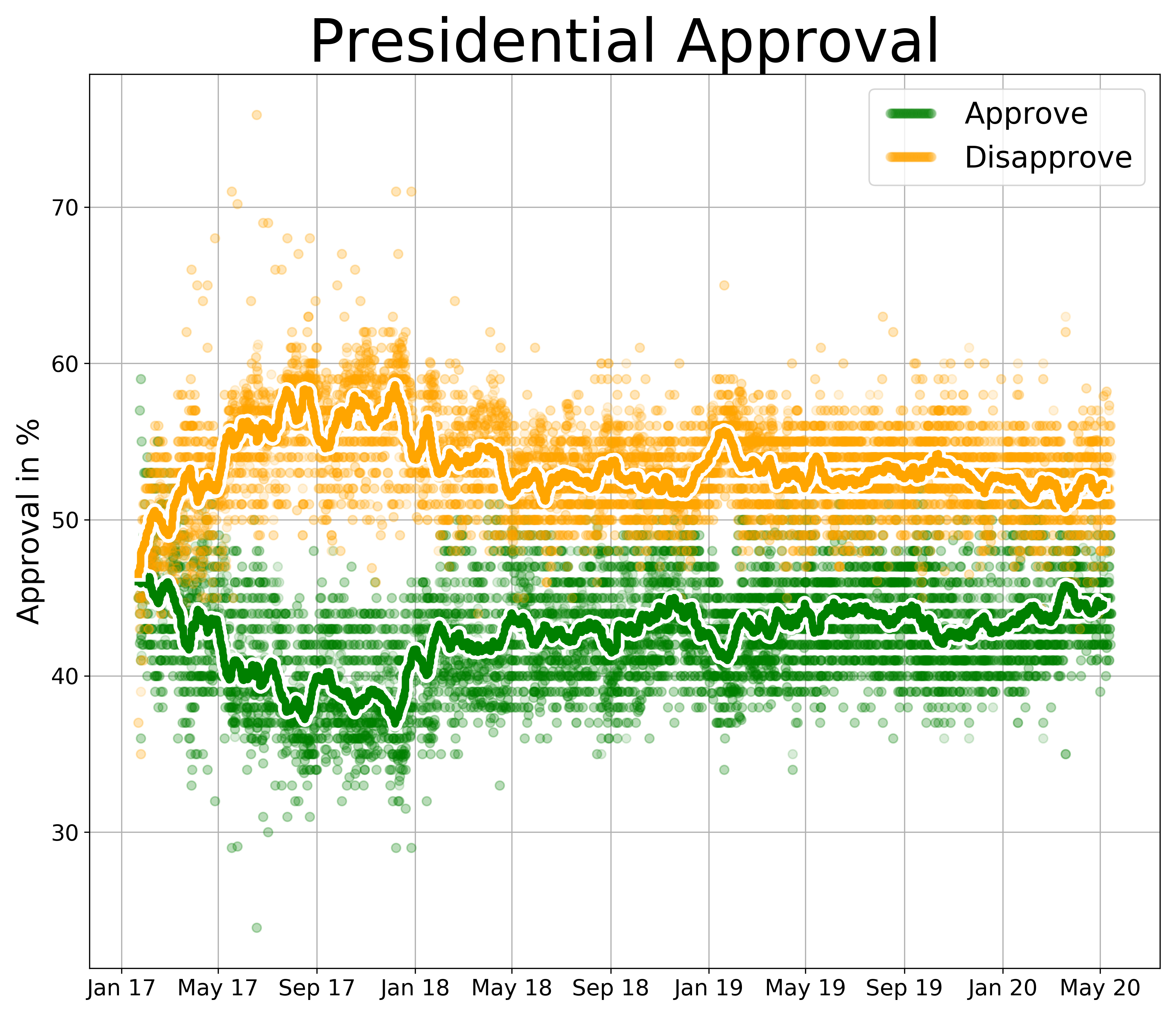
You can visit their site if you want an in-depth analysis on how exactly they calculate their numbers, and we aren’t going to emulate that today. Rather, we are going to build a similar chart in appearance using Python. The finished result looks something like this:
Not an exact replica, but something similar that is also relatively easy to build with basic tools.
Getting The Data
The first step is to get our data. Head over to FiveThirtyEight’s data page, and download (the blue arrow) the data for “How Popular is Donald Trump?” A folder containing two CSV files will be downloaded to your machine. The “approval_polllist.csv” is the one we are looking for.

For purposes of this tutorial, we are going to covert the CSV into an Excel file. Open the CSV in Excel, and choose Save As… and save the file somewhere convenient. I chose my desktop.

Once you’ve done this, we need to make a couple changes to the data to make our code simpler. First, we need to rename a couple columns. While the columns as labeled work fine, changing them now will make it easier down the line to determine which is which. Columns “L” and “M” should have the header row changed to “yes” and “no” respectively:

Next, we need to select all of the data (ctrl-A on a PC, ⌘-A on a Mac), and filter it:

Once that’s been done, sort column “E” (endnote) descending:

Getting Started With Python
If you don’t already have Python and an IDE installed, you will need to do that first. I won’t go over it here, but there are countless tutorials across the web that can get you started.
First we will need to install two third party packages. MatPlotLib and Pandas. Installation instructions can be found on their respective websites.
Once installed, we will import them at the top of our Python file, starting with MatPlotLib, like so:
import matplotlib.pyplot as plt
import matplotlib.patheffects as pe
import matplotlib.dates as dt
A few notes here. The .pyplot library is what will actually build our charts, or plots as they are otherwise known. The .patheffects will allow us to change some of the styling of our chart, and the .dates will allow us to format dates a little more cleanly.
Next, we need to import pandas:
import pandas as pd
from pandas.plotting import register_matplotlib_converters
register_matplotlib_converters()
Pandas gets imported all at once. The second and third lines are simply there for compatibility reasons.
Next, we can pull the data into our program, using Pandas. Replace the file path with the file path on your machine:
# Read the data
df = pd.read_excel("/Users/ardenott/Desktop/approval_polllist.xlsx")
We’ve used “df” as the variable for our data because it is short for “data frame,” an object type frequently used in data science. It also keeps the variable name short as we will be referring to it often.
Great work! The data should now be pulled into your program. If you run the program right now, you won’t see any output, as we haven’t told MatPlotLib to output anything yet. So let’s work on that.
Displaying the Data
Next, lets see if we can output our data to a chart, even if the formatting will be off. Insert this code below what you’ve already written:
plt.plot(df['enddate'], df['yes'])
plt.plot(df['enddate'], df['no'])

plt.show()
All we are doing here is having the program grab each “yes” and “no”, and place them on a chart with their end date. The “pot.show()” line is required at the end of the program every time you run it. If it isn’t there, no plot will be shown. If everything has been done correctly, it should look something like this:
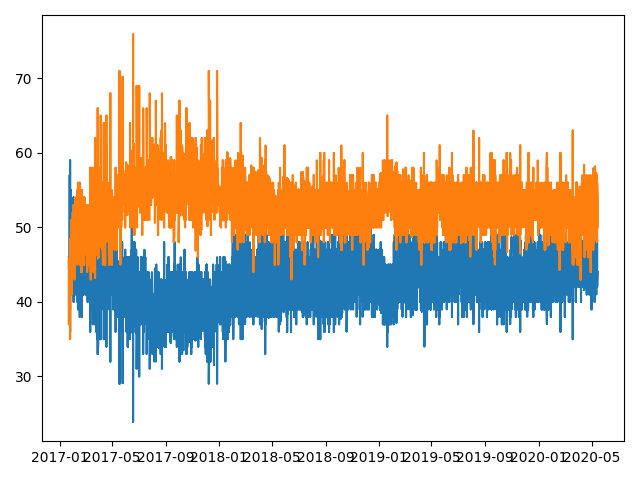
Pretty good, right? It’s obviously messy and difficult to read, but we can see some trends. The dates on the bottom certainly need some work. Let’s make a few changes to clean this up.
Let’s change the code above into this:
# Adjust figure size
fig, ax = plt.subplots(figsize=(11,9.5), dpi=300)

plt.plot(df['enddate'], df['yes'], marker='o', linestyle=' ', alpha=.15, color='g', markersize=6)
plt.plot(df['enddate'], df['no'], marker='o', linestyle=' ', alpha=.15, color='orange', markersize=6)

plt.show()
We’ve done a few things here. First, we’ve changed the figure size. This increases the actual size of the chart, making it much clearer and easier to read. It will also increase the processing time, so don’t be worried if it take a little longer to run than before.
We’ve also changed a lot of the formatting on the datapoints. The marker shape, outline style, alpha (transparency), color, and marker size have all been adjusted. Now it should look something like this:
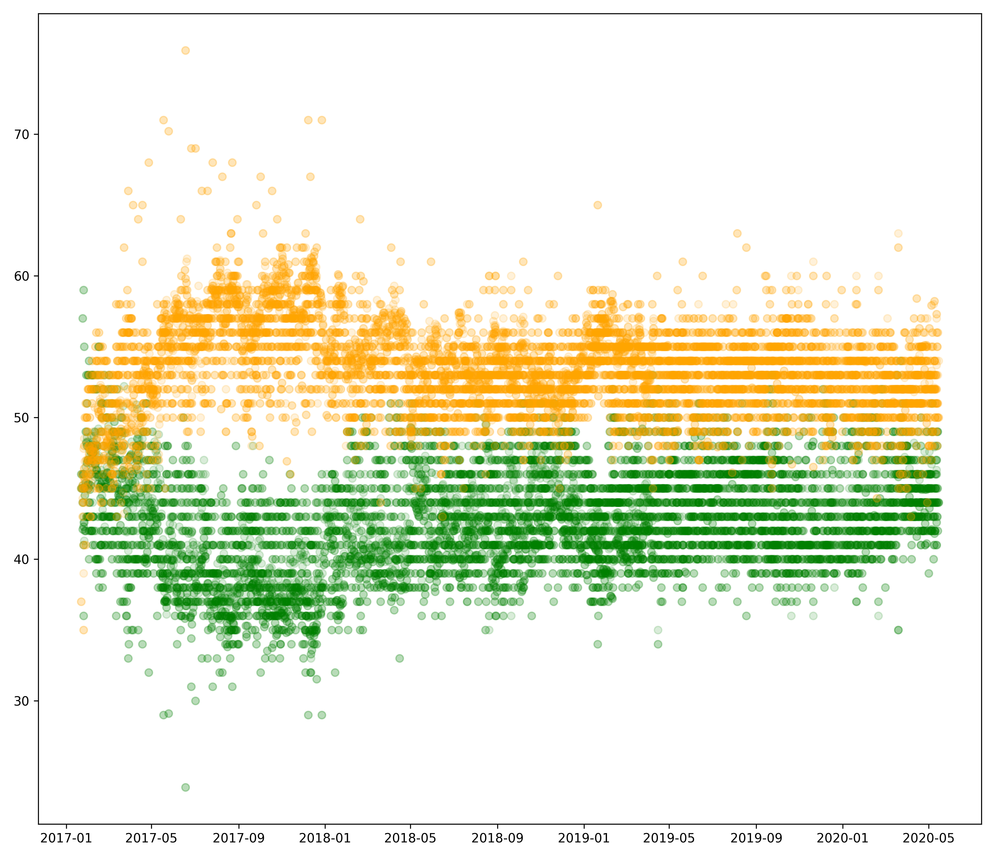
Now we’re getting much closer. The dots are where we want them. Next, let’s add the trend line to each side of the chart. In order to do this we need to first calculate the rolling average:
# Calculate the rolling average to smooth out data
rolling_mean_yes = df.yes.rolling(window=100).mean()
rolling_mean_no = df.no.rolling(window=100).mean()
Each of these variables will allow us to superimpose a line on top of our current chart. To draw the lines, add this underneath where you are drawing the dots:
plt.plot(df['enddate'], rolling_mean_yes)
plt.plot(df['enddate'], rolling_mean_no)
Your chart should now look something like this:

Again, it’s not pretty, but a little bit of formatting should fix that quickly. Change those two lines, adding the formatting details:
plt.plot(df['enddate'], rolling_mean_yes, color='g', lw=5,
         path_effects=[pe.Stroke(linewidth=10, foreground='white'),
         pe.Normal()])
plt.plot(df['enddate'], rolling_mean_no, color='orange', lw=5,
         path_effects=[pe.Stroke(linewidth=10, foreground='white'),
         pe.Normal()])

And with that, all of the major formatting has been finished. Now, we need to add some finishing touches to the rest of the chart to enhance readability.
Finishing Touches
The first thing we want to fix is the dates, as they are a bit of a mess at the moment. The are spaced out evenly, but the year-month combo isn’t the easiest to read. Underneath the code where you output the data (and before the plt.show()), insert the following:
# Reformat dates to enhance readability
date_form = dt.DateFormatter('%b %y')
ax.xaxis.set_major_formatter(date_form)
ax.tick_params(labelsize=15)
This will change the date format as well as the table sizes.
Next, we will add some basic gridlines. This is fairly straightforward:
# Add gridlines
ax.xaxis.grid()
ax.yaxis.grid()
After the previous two steps, the chart should look this this:

The last thing we need to do is add some labels so viewers know what the chart is actually talking about. That can be done like so:
plt.title('Presidential Approval', size=40)
plt.ylabel('Approval in %', fontsize=20)
plt.legend(['Approve', 'Disapprove'], numpoints=50, fontsize=20)
And voilà! The finished result.

I hope this guide has been useful. It is by no means comprehensive-there are still many improvements that could be made to enhance the visual. Feel free to experiment yourself! If you would like to view the full code for the project, I have it saved below. Thank you for reading!
import matplotlib.pyplot as plt
import matplotlib.patheffects as pe
import matplotlib.dates as dt
import pandas as pd
from pandas.plotting import register_matplotlib_converters
register_matplotlib_converters()


# Read the data
df = pd.read_excel("/Users/ardenott/Desktop/approval_polllist.xlsx")

# Calculate the rolling average to smooth out data
rolling_mean_yes = df.yes.rolling(window=100).mean()
rolling_mean_no = df.no.rolling(window=100).mean()

# Adjust figure size
fig, ax = plt.subplots(figsize=(11,9.5), dpi=300)

# Plot all data points and rolling average line
plt.plot(df['enddate'], df['yes'], marker='o', linestyle=' ', alpha=.15, color='g', markersize=6)
plt.plot(df['enddate'], df['no'], marker='o', linestyle=' ', alpha=.15, color='orange', markersize=6)
plt.plot(df['enddate'], rolling_mean_yes, color='g', lw=5,
         path_effects=[pe.Stroke(linewidth=10, foreground='white'), pe.Normal()])
plt.plot(df['enddate'], rolling_mean_no, color='orange', lw=5,
         path_effects=[pe.Stroke(linewidth=10, foreground='white'), pe.Normal()])

# Reformat dates to enhance readability
date_form = dt.DateFormatter('%b %y')
ax.xaxis.set_major_formatter(date_form)
ax.tick_params(labelsize=15)

# Add gridlines
ax.xaxis.grid()
ax.yaxis.grid()

# Format and print graph
plt.title('Presidential Approval', size=40)
plt.ylabel('Approval in %', fontsize=20)
plt.legend(['Approve', 'Disapprove'], numpoints=50, fontsize=20)
plt.show()